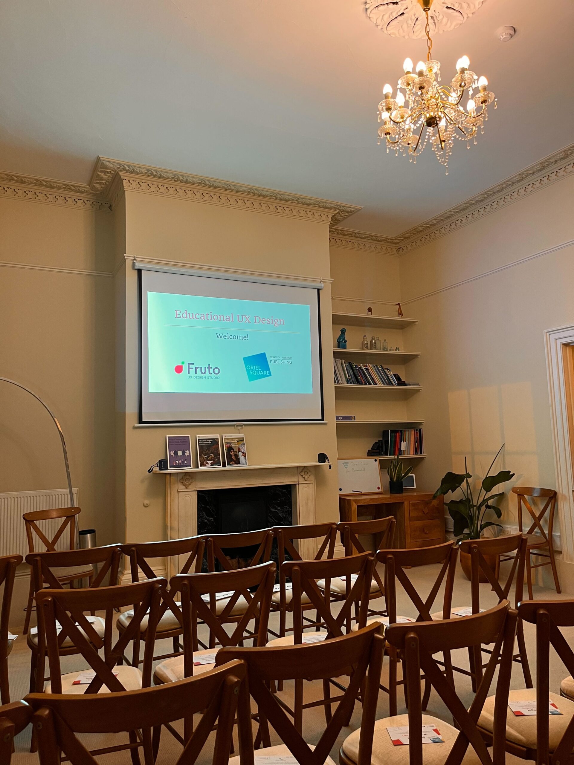
In November, Oriel Square and Fruto ran a joint event to promote best practice for user experience design within school education. Here, we report back on the key takeaways from our expert speakers in the field of educational UX design.
Know the humans you’re designing for
- Edtech should help people and serve education with technology – it should solve a need or a problem, and put the people before the product. It’s a human-centred sector, and so both requires and inspires excellent experience design. All good design relies on how well you know the humans you’re designing for.
- Design must consider the full context of a user and all the factors that influence their experience of the world in order to be effective – we know that teachers come to us already carrying a significant mental load; this year, 70% of teachers have seen a colleague cry within the first two months of the term (TeacherTapp). If we are optimising experiences for our most challenged, stressed, hurried and distracted users, then we’re helping to deliver value for all.
- It’s important that teachers are aware of how to access and use Edtech resources – just because resources are free, doesn’t mean teachers have time to find them. Making resources easy to use is key; they must be made across a range of formats and with the option to adapt them. It’s important to think about how teachers really feel – they are constantly overwhelmed, so don’t further overwhelm them.
- Despite the diverse and ever-changing needs of the teacher audience, many challenges are similar – the key is to design for common needs and then optimise for local needs.
All good design relies on how well you know the humans you’re designing for.
Iteration is important
- Release earlier than feels comfortable – you must be able to respond more quickly and get more feedback from your first release than you may feel comfortable with. This way, you can find what is working well and or not. In order to maintain a quick response to feedback and the sector, keep the quality high and safeguarding paramount, but design simple.
- Think about access to tech – as the pandemic continued schools started to need more digital access, especially for children from lower socioeconomic backgrounds. UX design meant making sure the user journey worked on all browsers. Changing the tech stack to be zero-rated (so that parents and children are not charged through their mobile data to access the site) can increase accessibility.
- We must subtract not just add – removing and simplifying design features is key. Many features are trialled and removed because the ideas didn’t meet needs and were never scaled. In the short term, you might have to take away valuable features, but in the long term, this allows a design team to focus. As teachers are time-poor, removing excess features is key to creating good, clean user journeys.
- Structured content formats are vital – content must move as quickly as the core product. In order to efficiently deliver existing content into new formats, content has to be created and stored uniformly to enable data to be easily transferred into the changed format.
As teachers are time-poor, removing excess features is key to creating good, clean user journeys.
Improve your customer research by embracing the challenge
- The way to reach children is via teachers – to reach more children, work to upskill teachers who often aren’t confident. The key to this is understanding the audience as real people, understanding what motivates them and how to support them in their digital journey. This means knowing what can go wrong such as understanding the impact of technical failure on a lesson, and the resource constraints on the ground in classrooms. Be very aware of the time-poor nature of teacher life when designing your resources and training.
- When reaching out to teachers for research, the scale is a challenge – the process of collecting teacher insights includes running the research, gathering insights, developing personas, beta testing and researching the impact. With a large user base, don’t pretend you can do research that covers everyone but start somewhere pragmatic.
- Developing useful personas that cover the variation in users can be a pain point – successful personas explain the key differentiators between users and speed up the design process by giving a frame of reference. For example, personas have to be created for different types of teachers, such as generalists and specialists.
Further reading
Our event partner, Fruto, is an expert in UX design. Check out their blog for more resources and practical tips:
- Product design in educational publishing: Overcoming the big three challenges faced by UX teams
- Design leadership: How to establish a design-led culture
- Strategic vs Tactical UX: Deciding between approaches for your next project
- You can also find useful resources on UX design here

